Butter
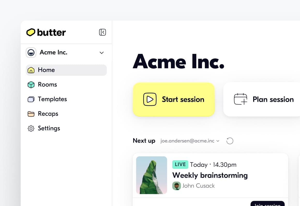
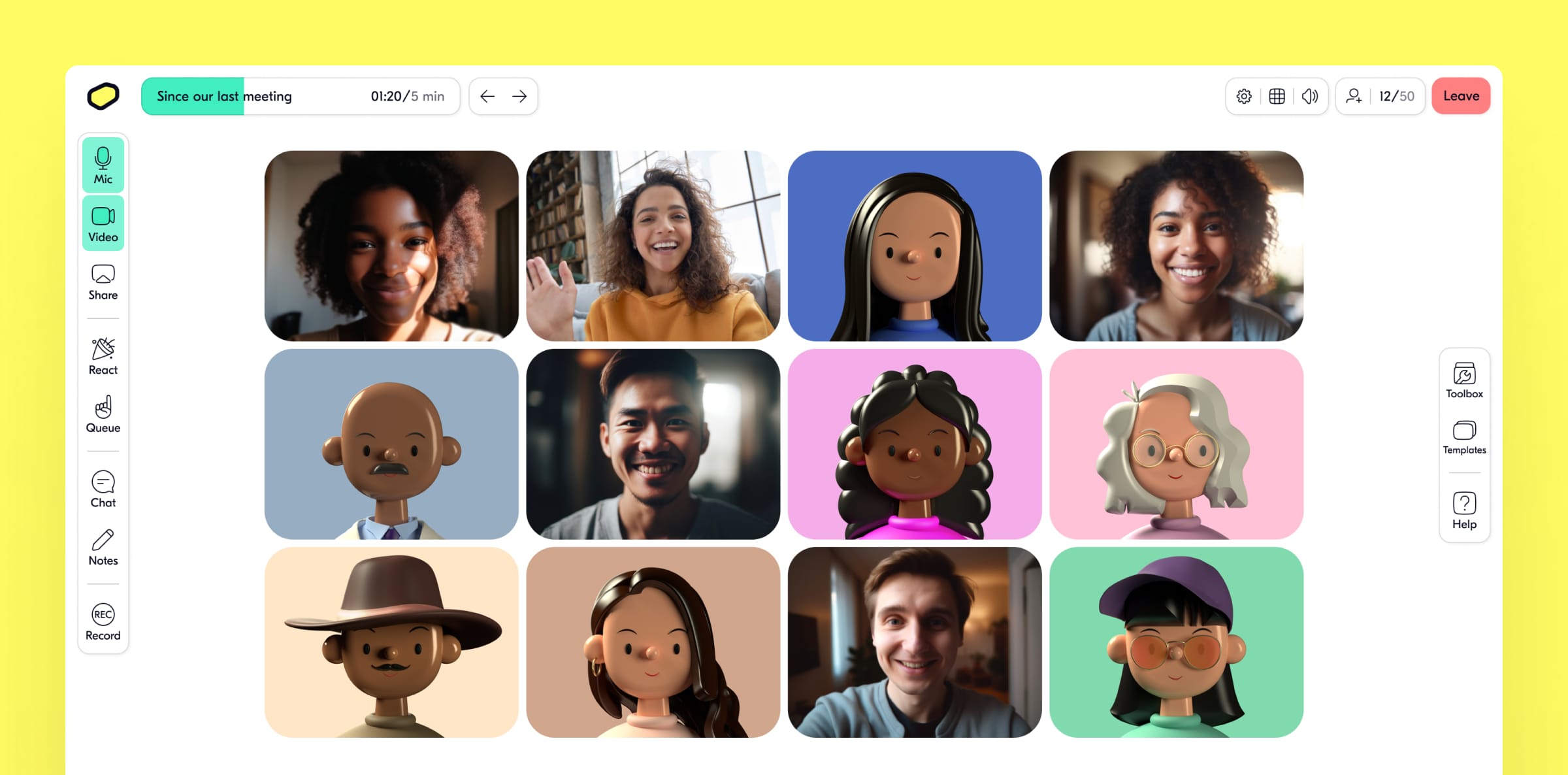
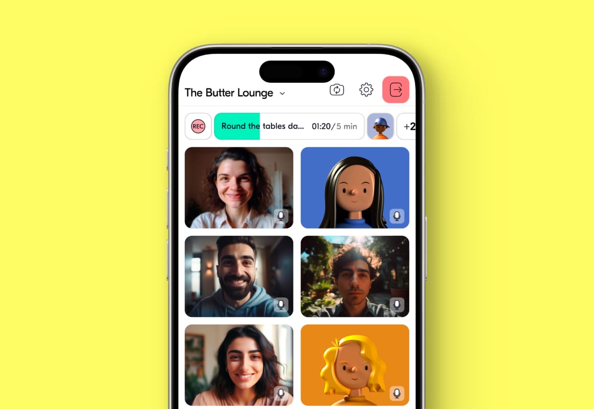
Butter is crafted for smooth facilitation of collaborative sessions, from training to workshops, ensuring they are more than just meetings. It's a comprehensive tool, functioning smoothly across mobile, desktop app, and browsers.
In my role as Product Design Lead, I worked with the team to keep our branding strong while making sure the experience was clear and simple for users. I led major features like the Agenda Planner and Session Recaps, shaping and constantly improving the overall user experience. Our goal was to meet the high expectations users had for modern, efficient tools, ensuring Butter always looked great and worked smoothly.
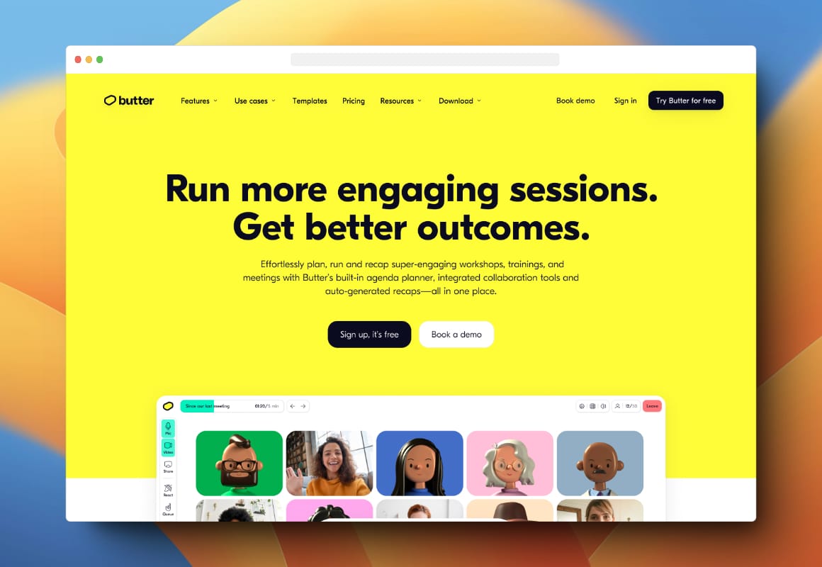
I also used Webflow for the Butter website design. This allowed us to quickly create and experiment with content, giving the growth team the freedom to update the site on their own without relying too much on developers. This flexibility helped us continuously improve the website and effectively show off Butter's features.